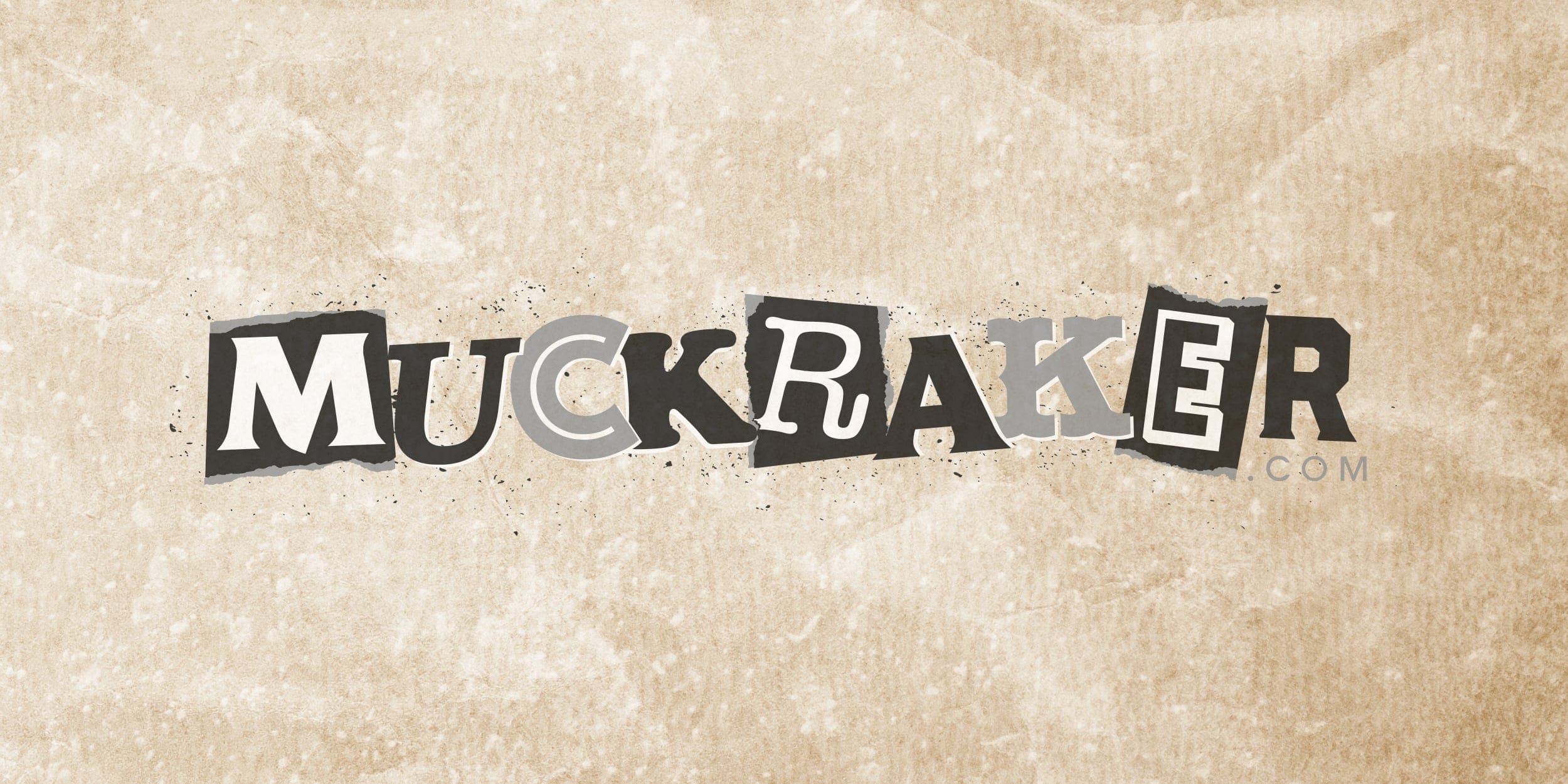
“It was a rudimentary, bare-bones website that I designed in a week many years ago… it needed a total facelift.” — Anthony Rubin, Muckraker.com
I first met Anthony Rubin in June 2024 in an underground speakeasy in lower Manhattan. Later that year Muckraker Media approached GillyTech with questions about website design and how to take his site to the next level.
They had invested a lot in their work, the brand, and the domain name; it was fitting that a polish and brand refresh was next on the list.
The Challenge
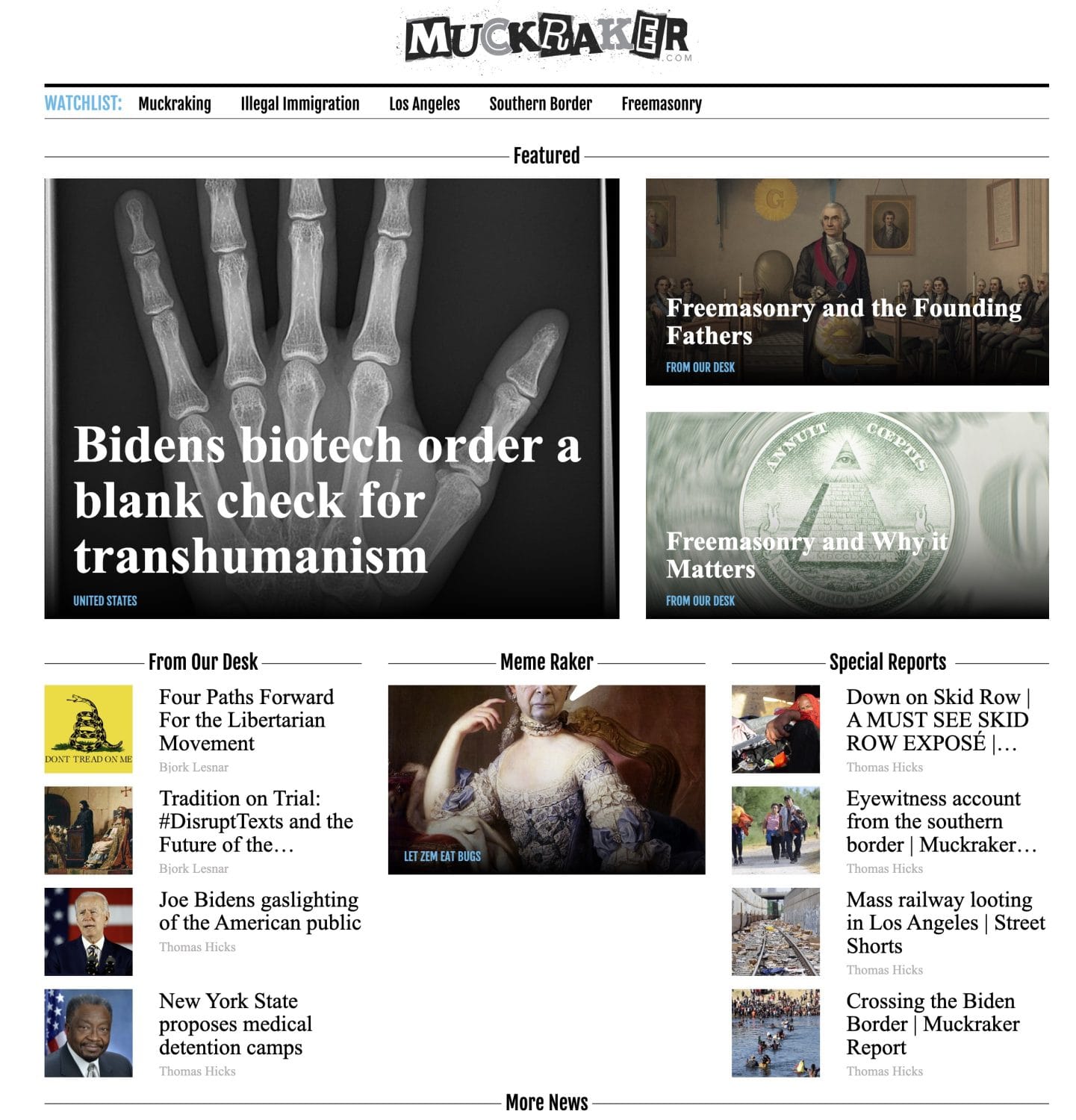
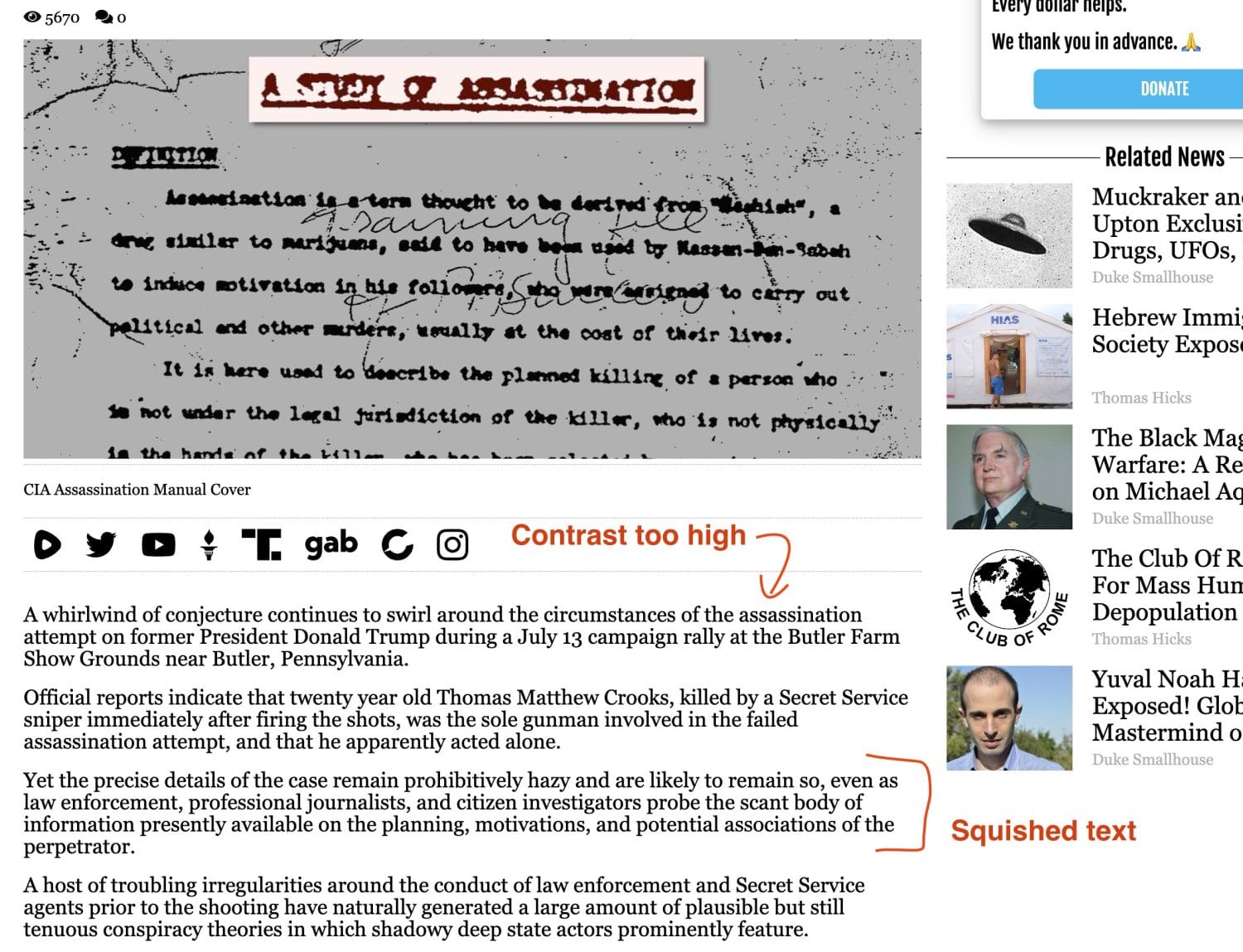
Muckraker Media had built a solid reputation in the journalism world, invested heavily in its brand and domain, but the website simply wasn’t doing justice to that investment. It was plain black text on white, set in a basic serif font—clean, but missing the personality, edge and visual authority the brand deserved.
The ask was clear: refresh the site to match the voice of Muckraker Media—credible, bold, investigative.
Before We Started
Approach
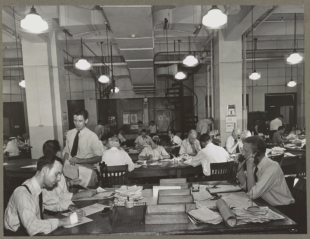
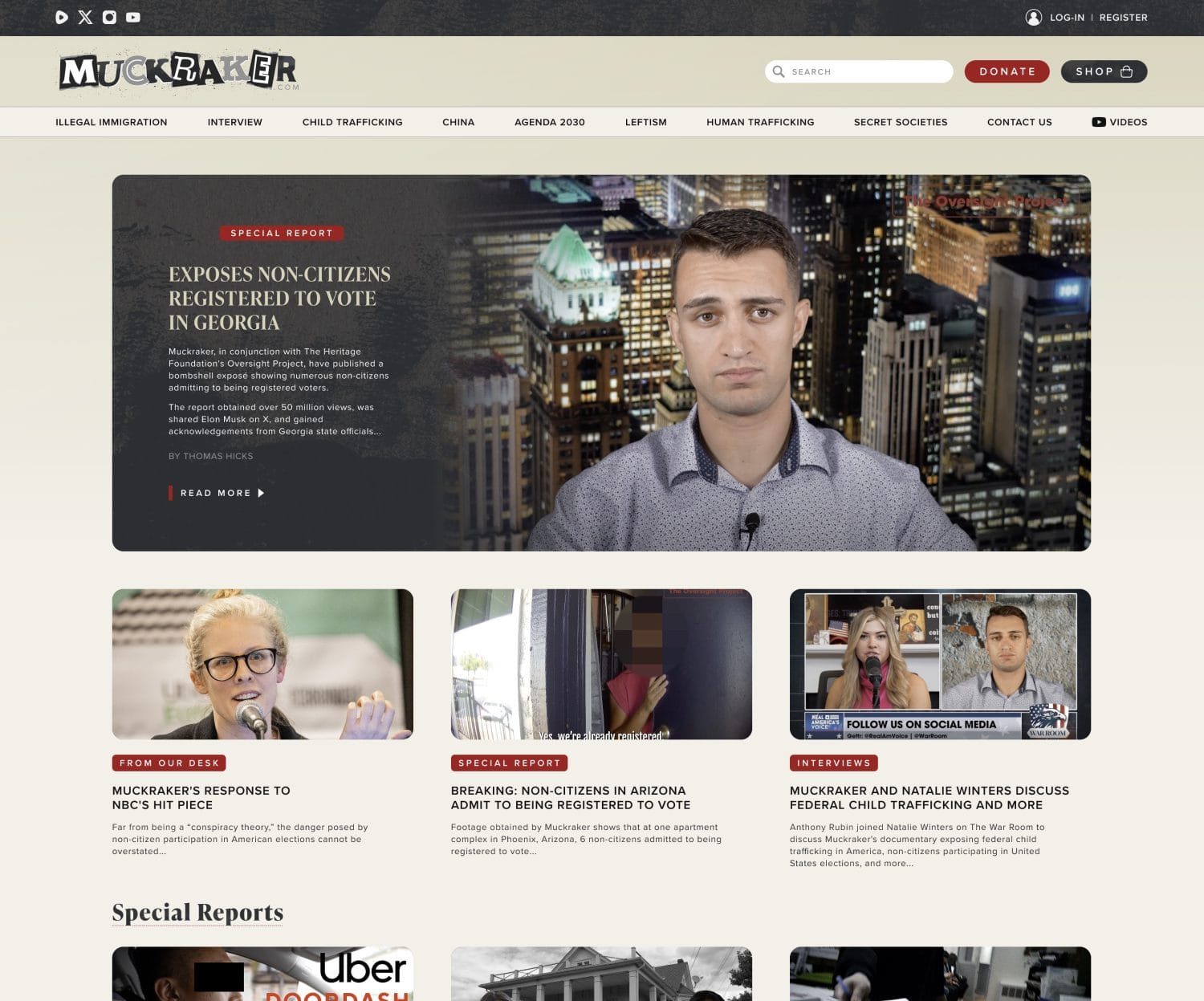
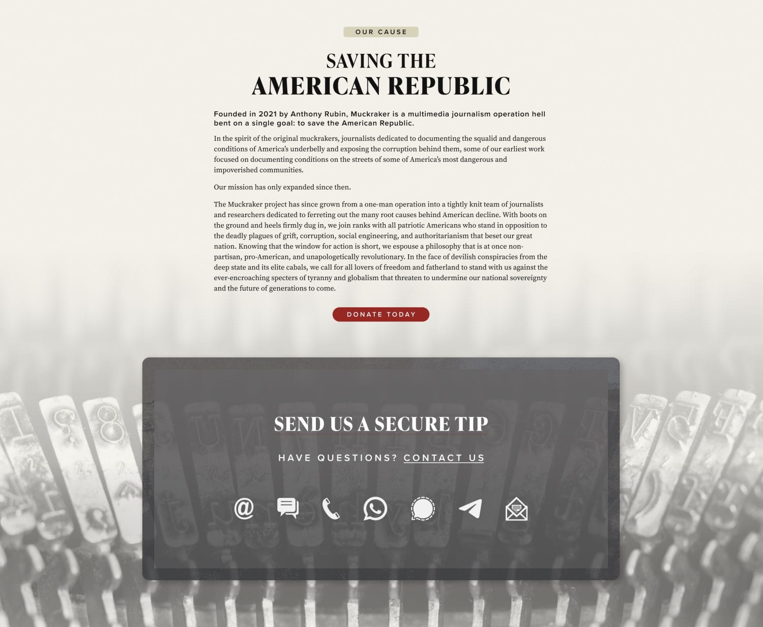
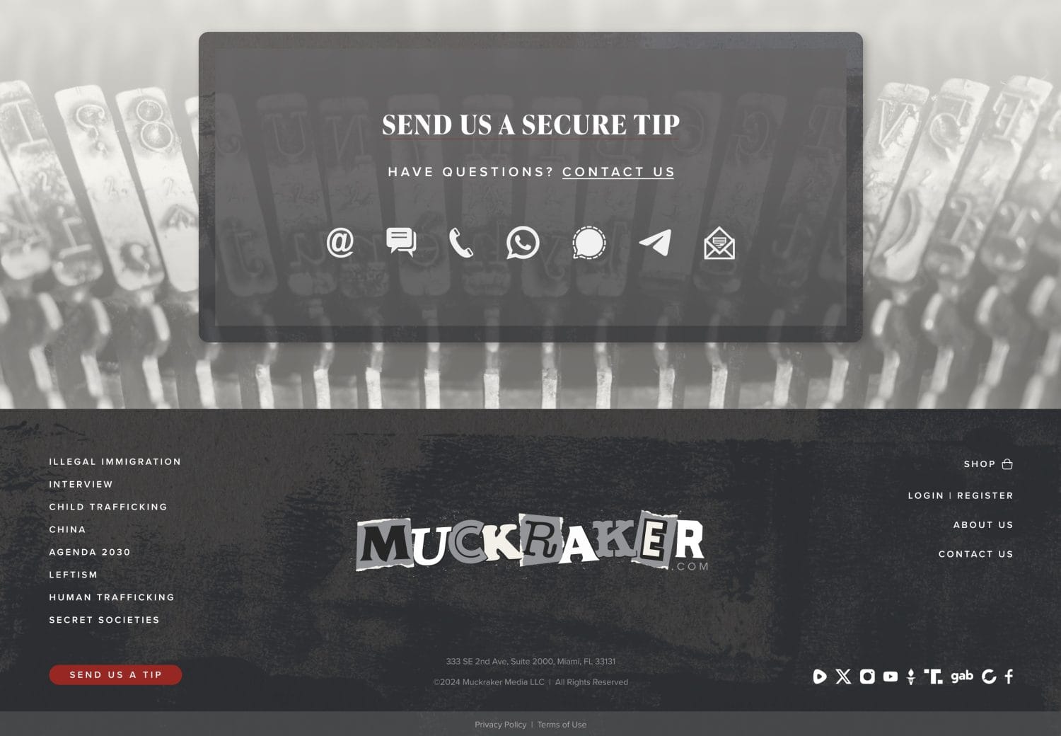
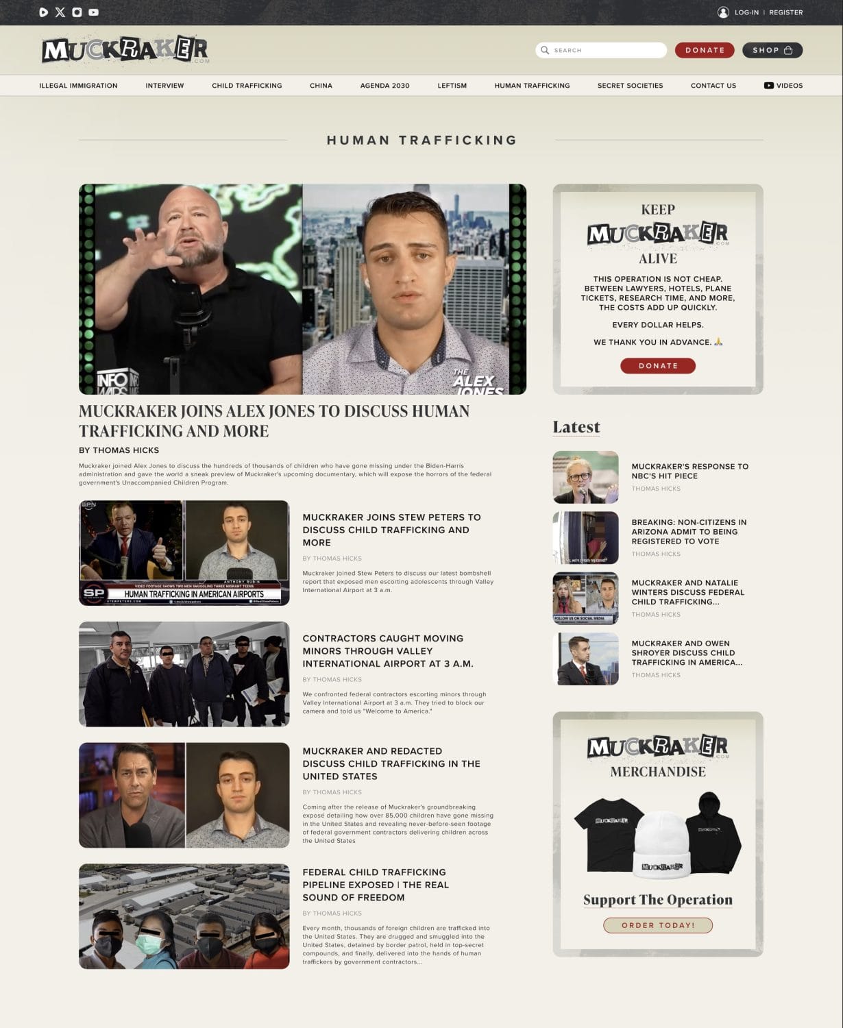
We started with a series of strategic calls to unpack the brand’s heritage, core values and visual identity. We landed on a concept that honoured the world of old-school investigative journalism: teletype machines, ticker tape, newsroom energy. The aesthetic was mid-century newsroom meets digital first-look.
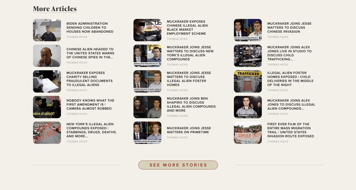
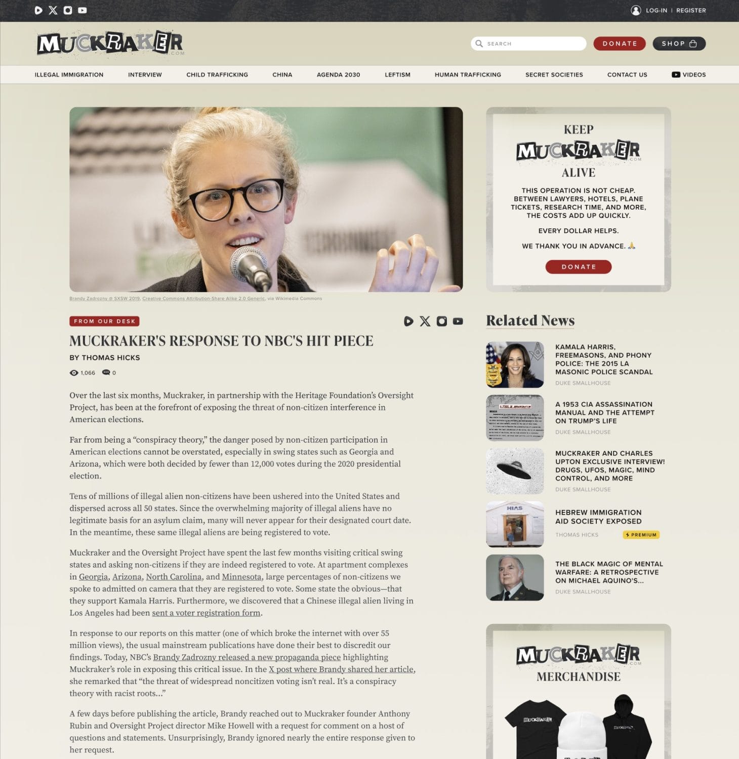
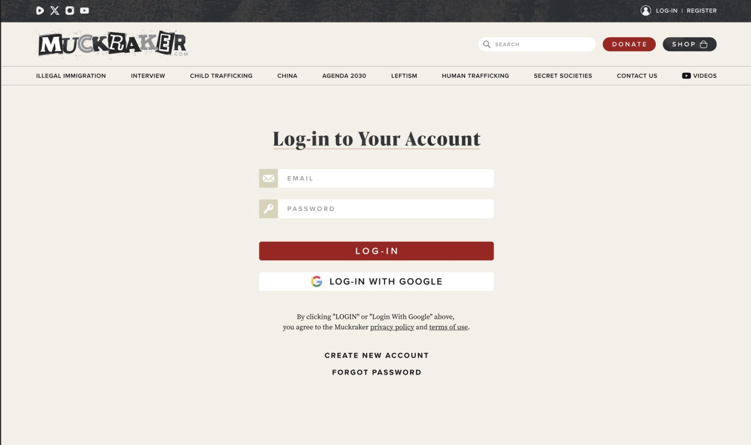
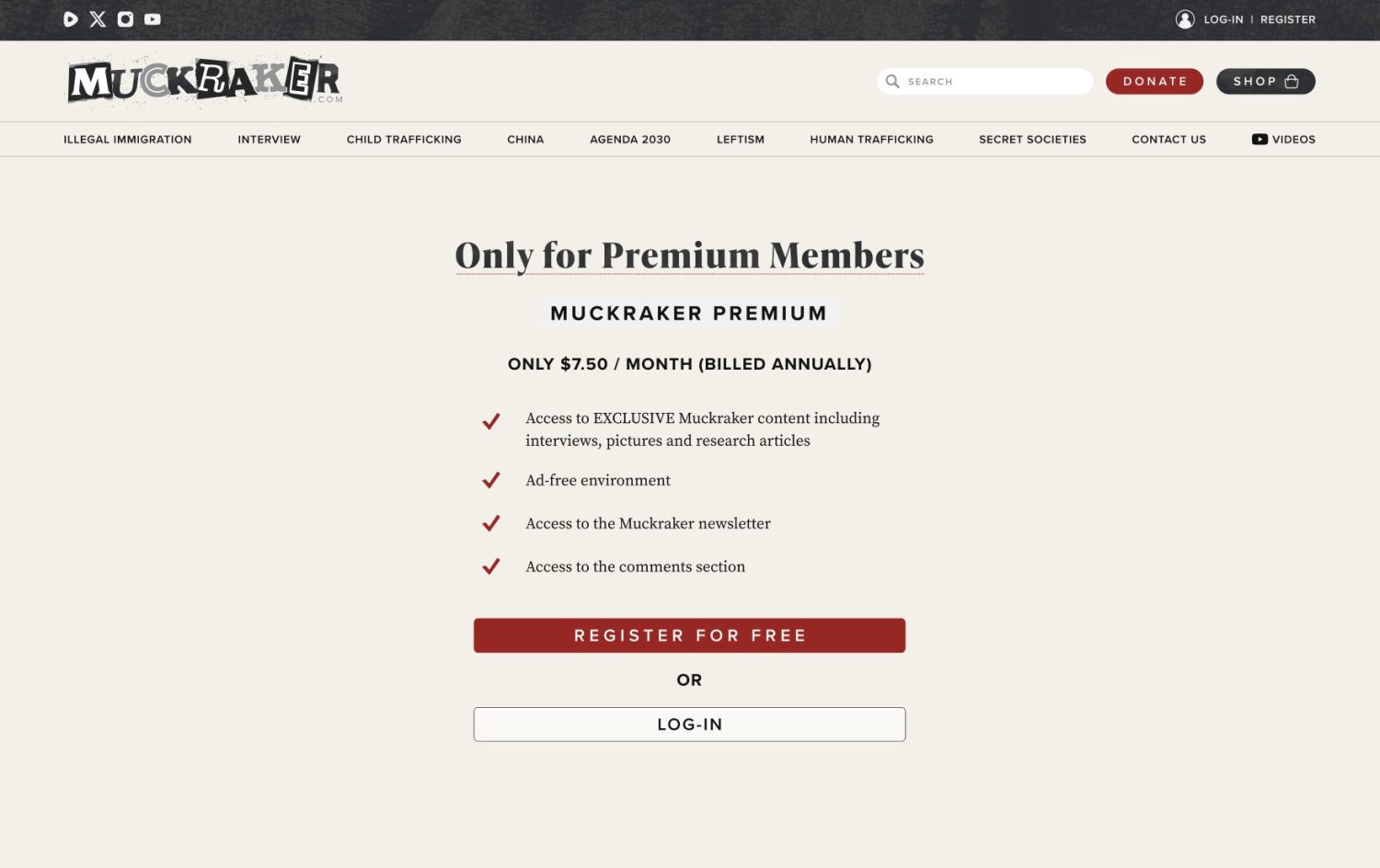
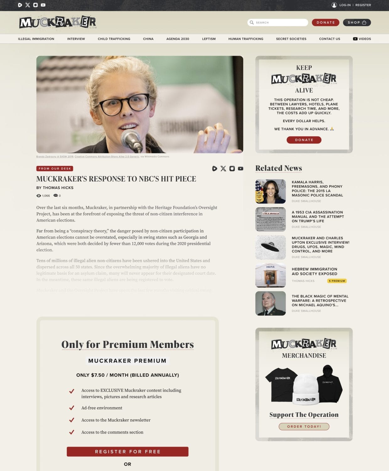
We sketched moodboards, iterated design routes, refined the visual language—then translated the winning direction into layout templates for home page, article listings, topic hub, paywall screens and login page.
Solution Highlights
- Design System: We introduced a bold yet readable serif for headlines, paired with a clean sans-serif for body text, evoking print-era journalism with modern readability.
- Visual Branding: Elements like teletype-inspired icons, subtle ticker-tape motifs and high-contrast black-and-white photography helped reinforce the “just the facts” and “hot off the press” vibe.
- Modular Layouts: From home page hero to deep dive article pages, each module was built in a way that could scale with the brand.
- Technical Execution: Delivered within scope and budget—no surprise overages. Everything was approved, built and handed over on schedule.
The Results
- The new site gave Muckraker Media a platform with the design polish and domain authority to match its journalistic ambitions.
- Feedback from Anthony: “…they gave me some initial designs … very enjoyably and easily … we came to a design that was beautiful, and that’s what it is today.”
- On our part: we delivered a full brand refresh and site redesign at a competitive price, with no hidden costs and on time.
Muckraker now has a visual identity and site architecture built for growth—whether that’s deeper investigative content, premium subscriptions or wider topic verticals. As a next phase, we’ll be exploring performance optimization, advanced analytics and conversion design to further support publishing goals.
Get in Touch
If your brand is ready for a design and website that works as hard as you do, reach out. We talk real solutions, on time and on budget.
